Introduction
In Module 2 of EDCI 337, titled “Design Principles for Effective and Accessible Multimedia”, we discussed the idea of accessibility when it comes to multimedia design, and how proactive accessible design benefits everybody, not just those with a disability.
Topics
The main topics we discussed were the idea of how to make your posts more accessible and how to design for a wider audience.
Designing for accessibility means that you provide means for the content you create to be accessed by a variety of people, regardless of their physical or mental disabilities, and by utilizing that concept, you are able to build your platform and the content generated by it from the ground up with the principles of inclusivity, which allows you to reach a much larger audience.
In order to achieve this, you need to think about the edge cases. How could I make my posts more readable for people who use Text-to-Speech/Screen Readers? How could I make my designs look nicer for those who are colour blind? How could I add more customization features that would benefit people and give them more autonomy? All of these are questions you can and should ask yourself while designing for accessibility. With questions like these in mind, you can envelope everybody by constantly thinking about the edge cases.
Discussion
This module was definitely interesting to me. I had never thought about accessibility when making my designs or blog posts, so learning about them definitely opened my eyes to a lot of the mistakes I was making before. This was highlighted by the WAVE accessibility report, which showed me how a lot of the default colour choices that came with the blog made it harder to read. It also identified how I had forgotten to give some form of alt text for the screen cast video I had added, which I will definitely consider fixing in my future posts.
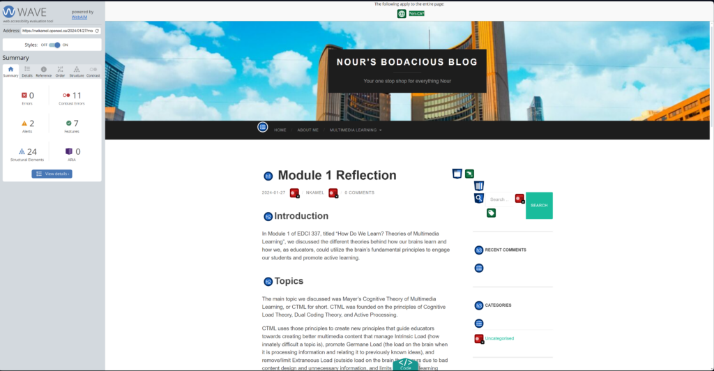
Alt Text: Image showing the “Module 1 Reflection” Blog post available on my blog on the right. On the left, the WAVE Accessibility Report scoring metric is shown with various alerts and structural, contrast, and feature errors in the blog post being highlighted.
Another interesting element that I was never exposed to before was Text-to-Speech/Screen Readers. By “never exposed to before”, I mean I was never exposed to the idea of how some people have to rely on features like this to be able to browse the internet. I also found it interesting how many Screen Readers struggle to read bold or italic text due to the nature of them being different from regular letters, and I was surprised by how we are never taught anything like this in school or university, despite the fact that designing for something like this is neither difficult nor time consuming, and keeping it in mind helps a lot of people.
Infographic
Creating the infographic definitely helped me utilize the principles of design that we learned about this module and apply them to a topic I feel does not get enough attention. I definitely found having a template easier to start with as creating something from scratch would have been overwhelming. I also found it very satisfying to properly align and match everything so that it was as pleasing to the eye as possible. I will definitely keep all of the principles we learned this module in mind, both in this course and in my career.
Alt Text: Infographic discussing Stroke Prevention
Transcript: Title is Stroke Prevention. First box contains info on how to stave off strokes. First title is regular exercise and the body says Keeping your body active and at a healthy weight will greatly reduce your risk of a stroke. For adults, doctors recommend 2 hours and 30 minutes of moderate exercise, like a brisk walk, per week. Second title is balanced diet and the body says Ensuring that you have a balanced diet with lots of fruits and vegetables, as well as eating foods low in saturated fats and cholesterol, will decrease your risk of a stroke. Third title is regular health check ups and the body says Make sure to get your blood pressure checked regularly. Having blood tests done and, if applicable, managing your diabetes are good ways to check for signs of a stroke early. The second box has the title strokes do not see age with a graphic of a 34 percent and another graphic of 10 people with 3 being highlighted and the body says Strokes can affect anybody. In 2009, 34% of people that were hospitalized for a stroke were younger than 65 years old. Third box has the title first aid for stroked with an image of the hand of a person helping another person up and an image of a telephone being held by a hand. The body says In the unfortunate case that you, or somebody you know, suffer a stroke, use the following procedure: First, Call emergency services. If you are suffering a stroke, have somebody else call them for you. Second, Make sure that the person suffering from a stroke is in a comfortable position, preferably lying down on one side with their head slightly raised, and that they are breathing. Third, Keep them warm with a blanket and don’t give them anything to eat or drink. Fourth, When the emergency operator arrives, tell them when symptoms started and what they were. The last thing in the infographic is a small box containing the link to Nour’s Bodacious Blog.
Conclusion
This has been the most eye opening module so far. I learned a lot about accessibility and feel like my designs will greatly benefit from what I have learned. By applying what I learned, I can create content that is easy to access by everyone, even those without a disability. I hope you enjoyed my blog for this module. See you in the next one!
Looks good overall, the discussion seems pretty clear and detailed.
One issue which I think could have been better is if you had your infographic show up instead of having it as a downloadable? I think having it as a downloadable creates more friction while reading the content!
Text descriptions looks good otherwise:)
Hey Saksham, I agree with you 100%. Adding the infographic as a regular image would have been better, but I was unable to do so in this post due to its aspect ratio making it blurry if posted as a regular image. I had to go with this format or have it look pretty horrible haha. Hope you enjoyed the rest of the post regardless!
Hey Nour! Great work on the blog posts and the format that you chose to share the blogs in. It seems quiet user friendly to go over the blogs one by one. I am a sucker for details and found the contents of the post very interesting because of that. The depth of these blogs show your level of conviction towards the website and it’s very impressive. The WAVE Accessibility rating also shows that you were very considerate and covering all the bases for the readers. Keep up the work!